Overview
This how-to guide shares the steps to add a pivot facet to your Search UI. We would be adding a TreeList component to the search UI.
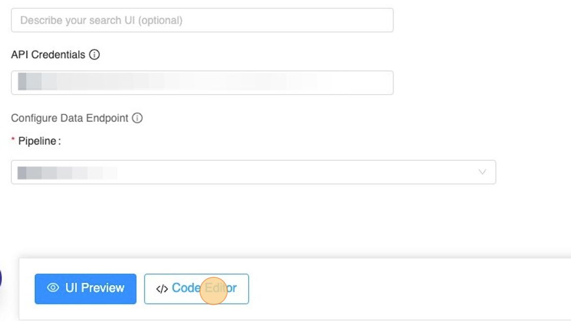
Pre-requisite: Create a Search UI
You can follow this 👇🏻 step-by-step tutorial to build a new Search UI, incase you already don't have one.
Now that we have a Search UI, Let's begin adding a facet to it!! 🏎
Editing the code
1. Within your search UI, click on Code Editor.
2. Navigate to "constants.js" from the file explorer.
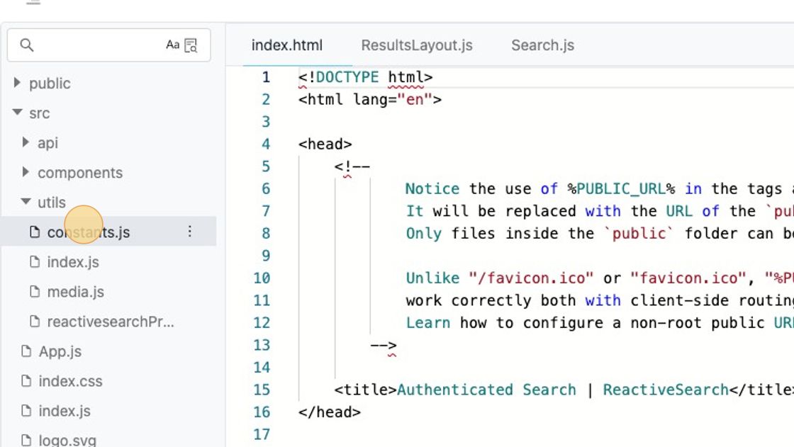
constant.jsstores a JSON constant namedappbasePrefswhich is further processed(internally) 🪄 to generate the Search UI.
3. Paste the snippet
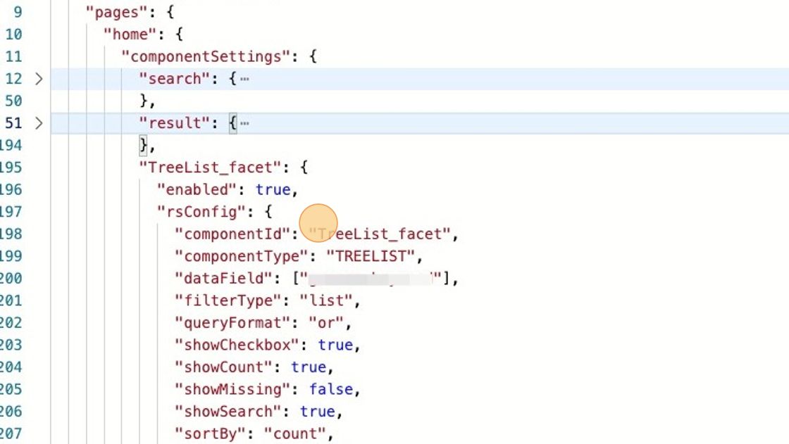
Within the preferences JSON, under pageSettings > pages, locate the page you intend to add the facet to.
For Example, Here I would be adding the facet to the home page.
Paste the following JSON snippet under pageSettings > pages > home > componentSettings
"TreeList_facet": {
  "enabled": true,
  "rsConfig": {
    "componentId": "TreeList_facet",
    "componentType": "TREELIST",
    "dataField": ["<!-- relevant dataField should be put here --->"],
    "filterType": "list",
    "queryFormat": "or",
    "showCheckbox": true,
    "showCount": true,
    "showMissing": false,
    "showSearch": true,
    "sortBy": "count",
    "title": "Categories"
  }
}
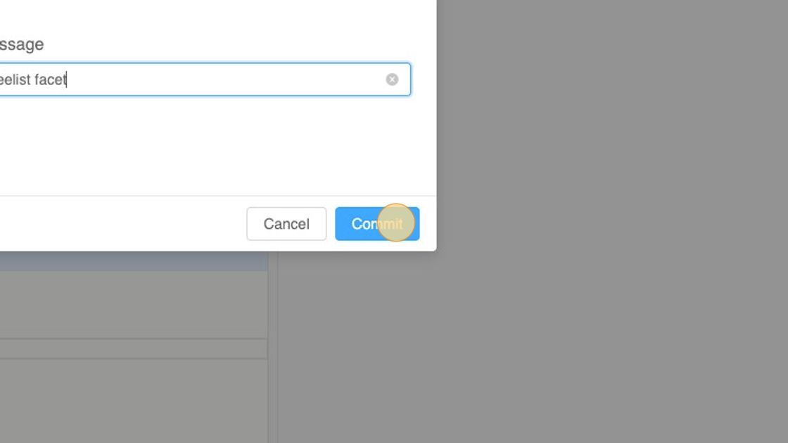
4. Commit the code and Deploy
🎊 🙌🏻 You should see the TreeList pivot facet on the home page of the deployed search app.
Something similar 👇🏻

Understanding the facet config snippet
Let's take a look and try to understand the snippet we pasted to add the TreeList component
"TreeList_facet": {
  "enabled": true,
  "rsConfig": {
    "componentId": "TreeList_facet",
    "componentType": "TREELIST",
    "dataField": ["<!-- relevant dataField should be put here --->"],
    "filterType": "list",
    "queryFormat": "or",
    "showCheckbox": true,
    "showCount": true,
    "showMissing": false,
    "showSearch": true,
    "sortBy": "count",
    "title": "Categories"
  },
  "customMessages": {
    "loading": null,
    "noResults": null
  },
}-
enabledA boolean to indicate whether the facet is enabled/ disabled. -
rsConfigThis key is responsible for storing all the component props accepted by a ReactiveSearch component. With an exception offilterTypeandcomponentType, all the other keys are props consumed by the ReactiveSearch components.In this how-to guide we have used the
<TreeList />component whose props definition can be explored here in detail.-
filterType NoCode Search UIs can be incorporated with different types of facets, to categorize them we have the
filterTypekey passed in thersConfigJSON which is used internally by the code-logic to render the Search UI. Acceptable values aredate,range,list, etc. -
componentType This prop is used internally by the lib(ReactiveSearch) to figure out the component type of the added component. Click here to checkout all the accepted
componentTypes.💡 Our lib takes a general approach to render components by rendering them as a ReactiveComponent(part of ReactiveSearch lib), which is a generic component to build reactive search UIs.
-
-
customMessagesThe key can be used to provide custom messages for different state of the component UI, for example"customMessages": { "loading": "Loading...", // message displayed when the results are still loading "noResults": "No results found" // message displayed when no results could be found },


