GeoDistanceSlider creates a location search based range slider UI component that is connected to a database field. It is used for distance based filtering.
Example uses:
- finding restaurants in walking distance from your location.
- discovering things to do near a landmark.
Usage
Basic Usage
<ReactiveBase
  mapLibraries={['places']} // required
>
    <GeoDistanceSlider
        componentId="locationUI"
        dataField="location"
        range={{
            start: 0,
            end: 20,
        }}
    />
</ReactiveBase>
Usage With All Props
<ReactiveBase
mapLibraries={['places']} // required
>
<GeoDistanceSlider
componentId="GeoDistanceSensor"
compoundClause="filter"
dataField="location"
title="Geo Distance Slider"
range={{
start: 0,
end: 20,
}}
rangeLabels={{
start: '0 mi',
end: '20 mi',
}}
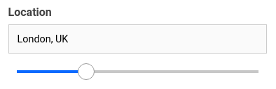
defaultValue={{
location: 'London, UK',
distance: 12,
}}
countries={['uk']}
placeholder="Select a distance range.."
unit="mi"
autoLocation={true}
showFilter={true}
filterLabel="Location"
URLParams={false}
onData={
(prop) => {
const {value, error} = prop;
// do something
}
}
/>
</ReactiveBase> Props
componentId
| Type | Optional |
|---|---|
String |
No |
unique identifier of the component, can be referenced in other components' react prop.
compoundClause
| Type | Optional |
|---|---|
String |
Yes |
Configure whether the DSL query is generated with the compound clause of must or filter. If nothing is passed the default is to use must. Setting the compound clause to filter allows search engine to cache and allows for higher throughput in cases where scoring isn’t relevant (e.g. term, geo or range type of queries that act as filters on the data)
This property only has an effect when the search engine is either elasticsearch or opensearch.
Note:
compoundClauseis supported with v8.16.0 (server) as well as with serverless search.
dataField
| Type | Optional |
|---|---|
String |
No |
data field to be connected to the component's UI view.
nestedField
| Type | Optional |
|---|---|
String |
Yes |
use to set the nested mapping field that allows arrays of objects to be indexed in a way that they can be queried independently of each other. Applicable only when dataField is a part of nested type.
title
| Type | Optional |
|---|---|
String or JSX |
Yes |
title of the component to be shown in the UI.
range
| Type | Optional |
|---|---|
Object |
Yes |
an object with start and end keys and corresponding numeric values denoting the minimum and maximum possible slider values.
rangeLabels
| Type | Optional |
|---|---|
Object |
Yes |
an object with start and end keys and corresponding String labels to show labels near the ends of the GeoDistanceSlider component.
defaultValue
| Type | Optional |
|---|---|
Object |
Yes |
pre-select the search query with location option and distance with distance option.
placeholder
| Type | Optional |
|---|---|
String |
Yes |
set the placeholder to show in the location search box, useful when no option is defaultValue.
value
| Type | Optional |
|---|---|
Object |
Yes |
controls the current value of the component. It sets the location & distance (on mount and on update). Use this prop in conjunction with onChange function.
onChange
| Type | Optional |
|---|---|
function |
Yes |
is a callback function which accepts component's current value as a parameter. It is called when you are using the value prop and the component's value changes. This prop is used to implement the controlled component behavior.
showIcon
| Type | Optional |
|---|---|
Boolean |
Yes |
whether to display a search or custom icon in the input box. Defaults to true.
iconPosition
| Type | Optional |
|---|---|
String |
Yes |
sets the position of the search icon. Can be left or right. Defaults to right.
icon
| Type | Optional |
|---|---|
JSX |
Yes |
displays a custom search icon instead of the default 🔍
unit
| Type | Optional |
|---|---|
String |
Yes |
unit for distance measurement, uses mi (for miles) by default. Distance units can be specified from the following:

autoLocation
| Type | Optional |
|---|---|
Boolean |
Yes |
when enabled, preset the user's current location in the location search box. Defaults to true.
showFilter
| Type | Optional |
|---|---|
Boolean |
Yes |
show as filter when a value is selected in a global selected filters view. Defaults to true.
filterLabel
| Type | Optional |
|---|---|
String |
Yes |
An optional label to display for the component in the global selected filters view. This is only applicable if showFilter is enabled. Default value used here is componentId.
URLParams
| Type | Optional |
|---|---|
Boolean |
Yes |
enable creating a URL query string parameter based on the selected location from the slider. This is useful for sharing URLs with the component state. Defaults to false.
countries
| Type | Optional |
|---|---|
String Array |
Yes |
restricts predictions to specified country (ISO 3166-1 Alpha-2 country code, case insensitive). For example, 'us', 'in', or 'au'. You can provide an array of up to five country code strings.
serviceOptions
| Type | Optional |
|---|---|
Object |
Yes |
allows to add more options to AutoCompletionRequest, available from Google Places library
tooltipTrigger
| Type | Optional |
|---|---|
String |
Yes |
trigger the tooltip according to the value specified. Can be hover, focus, always and none. Defaults to none.
renderTooltipData
| Type | Optional |
|---|---|
Function |
Yes |
customize the rendered tooltip content via a function which receives the tooltip content and expects a JSX or String back. For example:
renderTooltipData={data => (
    <h5 style={{
        color: 'red',
        textDecoration: 'underline'
    }}>
        {data}
    </h5>
)}
geocoder
| Type | Optional |
|---|---|
Object |
Yes |
give your own geocoder tool to mimic Google Map's one. Usefull if using ReactiveOpenStreetMap only and you want to search arround your positionned data. For example:
geocoder={{geocode: function (data, todo) {
    if (data.location) {
        todo([{formatted_address: data.location.lat + ',' + data.location.lng}],'OK');
    } else if (data.address) {
        const [tlat,tlng] = data.address.split(',');
        todo([{geometry: {location: {lat: () => tlat, lng: () => tlng}}}],'OK');
    } else {
        todo(null,'Not an address or a location');
    }
    }}
onData
| Type | Optional |
|---|---|
Function |
Yes |
gets triggered after data changes, which returns an object with these properties: value & error.
onData={
    (prop) => {
        const {value, error} = prop;
        // do something
    }
}
Demo
Styles
GeoDistanceSlider component supports innerClass prop with the following keys:
titleinputlistsliderselectcount
Read more about it here.
Extending
GeoDistanceSlider component can be extended to
- customize the look and feel with
className,style, - update the underlying DB query with
customQuery, - connect with external interfaces using
beforeValueChange,onValueChangeandonQueryChange. - specify how options should be filtered or updated using
reactprop. - add the following synthetic events to the underlying
inputelement:- onBlur
- onFocus
- onKeyPress
- onKeyDown
- onKeyUp
- autoFocus
<GeoDistanceSlider
  ...
  className="custom-class"
  style={{"paddingBottom": "10px"}}
  customQuery={
    function(location, distance, props) {
      return {
        // query in the format of Elasticsearch Query DSL
        geo_distance: {
          distance: distance + props.unit,
          location_dataField: location
        }
      }
    }
  }
  beforeValueChange={
    function(value) {
      // called before the value is set
      // returns a promise
      return new Promise((resolve, reject) => {
        // update state or component props
        resolve()
        // or reject()
      })
    }
  }
  onValueChange={
    function(value) {
      console.log("current value: ", value)
      // set the state
      // use the value with other js code
    }
  }
  onQueryChange={
    function(prevQuery, nextQuery) {
      // use the query with other js code
      console.log('prevQuery', prevQuery);
      console.log('nextQuery', nextQuery);
    }
  }
/>
className
| Type | Optional |
|---|---|
String |
Yes |
CSS class to be injected on the component container.
style
| Type | Optional |
|---|---|
Object |
Yes |
CSS styles to be applied to the GeoDistanceSlider component.
customQuery
| Type | Optional |
|---|---|
Function |
Yes |
takes location, distance and props as parameters and returns the data query to be applied to the component, as defined in Elasticsearch Query DSL.
Note: customQuery is called on value changes in the GeoDistanceSlider component as long as the component is a part of react dependency of at least one other component.
beforeValueChange
| Type | Optional |
|---|---|
Function |
Yes |
is a callback function which accepts component's future value as a parameter and returns a promise. It is called every time before a component's value changes. The promise, if and when resolved, triggers the execution of the component's query and if rejected, kills the query execution. This method can act as a gatekeeper for query execution, since it only executes the query after the provided promise has been resolved.
onValueChange
| Type | Optional |
|---|---|
Function |
Yes |
is a callback function which accepts component's current value as a parameter. It is called every time the component's value changes. This prop is handy in cases where you want to generate a side-effect on value selection. For example: You want to show a pop-up modal with the valid discount coupon code when a user searches within a specific location area.
onQueryChange
| Type | Optional |
|---|---|
Function |
Yes |
is a callback function which accepts component's prevQuery and nextQuery as parameters. It is called everytime the component's query changes. This prop is handy in cases where you want to generate a side-effect whenever the component's query would change.
react
| Type | Optional |
|---|---|
Object |
Yes |
specify dependent components to reactively update GeoDistanceSlider's options. Read more about it here.
- key
Stringone ofand,or,notdefines the combining clause.- and clause implies that the results will be filtered by matches from all of the associated component states.
- or clause implies that the results will be filtered by matches from at least one of the associated component states.
- not clause implies that the results will be filtered by an inverse match of the associated component states.
- value
String or Array or ObjectStringis used for specifying a single component by itscomponentId.Arrayis used for specifying multiple components by theircomponentId.Objectis used for nesting other key clauses.


