ResultCard creates a card UI component for a particular result item, it can be used with ReactiveList to display results in a card layout, suited for data that have an associated image.
Example uses:
- showing e-commerce search results in a card layout.
- showing filtered hotel booking results in a card layout.
Note
An alternative layout to ResultCard is a ResultList, which displays result data in a list format.
Usage
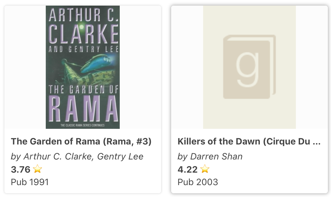
<template>
    <reactive-list
        componentId="SearchResult"
        dataField="original_title.raw"
        :from="0"
        :size="5"
    >
        <template #render="{ data }">
            <result-cards-wrapper>
                <result-card
                    v-bind:key="result._id"
                    v-for="result in data"
                >
                    <result-card-image :src="result.image" />
                    <result-card-title>
                        {{result.original_title}}
                    </result-card-title>
                    <result-card-description>
                        <div>
                            <p>
                                <em>by {{data.authors}}</em>
                            </p>
                            <p>
                                <b>{{data.average_rating}}</b> ⭐
                            </p>
                            <span>Pub {{data.original_publication_year}}</span>
                        </div>
                    </result-card-description>
                </result-card>
            </result-cards-wrapper>
        </template>
    </reactive-list>
</template>
Props
target
| Type | Optional |
|---|---|
string |
Yes |
This prop is equivalent to the target attribute of html a tags. It defaults to _blank.
href
| Type | Optional |
|---|---|
string |
Yes |
can be used to specify the URL of the page the link goes to
Note
ResultCard component accepts all the properties of html
atag.
Sub Components
ResultCardImage
use it to render the result card image. It accepts the following props:
src:stringsource url of the image
ResultCardTitle
renders the title of the result card.
ResultCardDescription
can be used to render the result card description UI.


